Color grading photos, often regarded as the unsung hero of photography, hold the power to transform a good photo into a visually stunning masterpiece. As we delve into color grading photos, it’s crucial to understand the nuances and techniques that contribute to achieving professional results.
I. Introduction
In the vast landscape of photography, color grading photos emerges as a pivotal process that adds depth, emotion, and coherence to visual narratives. Whether you’re an aspiring photographer or a seasoned professional, mastering the art of color-grading photos can elevate your work to new heights.
II. Understanding Color Theory
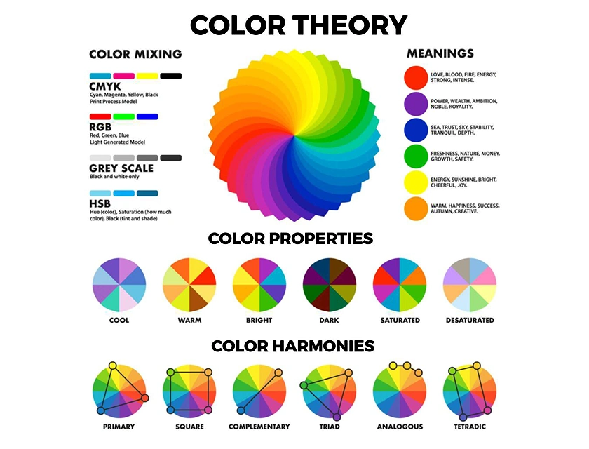
Before diving into the practical aspects of color grading photos, it’s essential to grasp the basics of color theory. Primary, secondary, and tertiary colors, along with the concept of color temperature, play a significant role in determining the mood and impact of a photograph.
III. Significance of Color Grading Photos in Photography
Color grading goes beyond mere aesthetic enhancement; it allows photographers to evoke specific emotions and maintain visual consistency across a series of images. The ability to convey mood and atmosphere through color sets professionals apart.
IV. Tools and Software for Color Grading Photos
To embark on your color grading journey, familiarize yourself with the tools of the trade. Industry-standard software like Adobe Lightroom, Capture One, and DaVinci Resolve provides a robust platform for photographers to bring their creative visions to life.
V. Step-by-Step Adobe Lightroom Color Grading Photos Process
A. Importing and organizing photos

Begin by importing your photos into Adobe Lightroom and organizing them for efficient editing.

B. Adjusting exposure and contrast
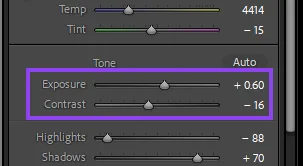
Fine-tune the exposure and contrast settings to lay the foundation for the color grading process.
Adjusting Exposure:
- Access the Develop Module:
- Open your photo in Adobe Lightroom and navigate to the Develop module, usually located at the top right corner of the interface.
- Locate the Exposure Settings:
- In the Develop module, find the “Basic” panel on the right-hand side. Look for the “Exposure” slider.
- Understand the Exposure Slider:
- The Exposure slider controls the overall brightness of your image. Moving it to the right increases brightness, while moving it to the left decreases brightness.
- Adjust Exposure:
- Assess your photo and decide if it needs more or less overall brightness. Make subtle adjustments to the Exposure slider until you achieve the desired exposure level.
Adjusting Contrast:
- Navigate to the Contrast Settings:
- Still in the “Basic” panel, locate the “Contrast” slider.
- Understand the Contrast Slider:
- The Contrast slider controls the difference between the light and dark areas of your photo. Increasing contrast makes the bright areas brighter and the dark areas darker, while decreasing contrast has the opposite effect.
- Balancing Contrast:
- Consider the dynamic range of your photo. If it lacks punch and looks flat, increasing contrast can add depth. If the contrast is too strong and some details are lost, decrease the contrast for a more balanced appearance.
C. Fine-tuning color balance
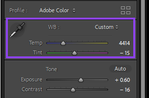
Achieve a natural and balanced look by adjusting the color temperature and tint of your photos.
Adjusting Color Temperature:
- Access the Develop Module:
- Open your photo in Adobe Lightroom and navigate to the Develop module, located in the top right corner of the interface.
- Locate the White Balance Settings:
- In the Develop module, find the “White Balance” settings on the right-hand panel. It typically looks like a dropper icon.
- Understand Color Temperature Sliders:
- The color temperature is measured in Kelvin (K). Moving the slider to the right (towards higher values) adds warmth (more yellow/red), while moving it to the left (towards lower values) introduces coolness (more blue).
- Adjust Color Temperature:
- Experiment with the color temperature slider until you achieve the desired warmth or coolness that complements the mood of your photo.
Adjusting Tint:
- Navigate to Tint Settings:
- Still in the White Balance section, locate the “Tint” slider next to the Color Temperature slider.
- Understand the Tint Slider:
- The tint slider primarily adjusts the green-magenta balance in your photo. Moving it to the right adds magenta while moving it to the left introduces green.
- Balancing Tint:
- Assess your photo and determine if there is any unwanted green or magenta cast. Make subtle adjustments to the tint slider until the colors appear more natural.
D. Adding creative color effects
Explore creative possibilities by experimenting with color grading techniques to enhance the visual appeal of your images.
VI. Common Mistakes to Avoid
A. Over-saturation and under-saturation pitfalls
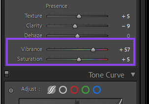
Striking the right balance is crucial; avoid over-saturating or under-saturating your photos.
B. Ignoring the impact of shadows and highlights
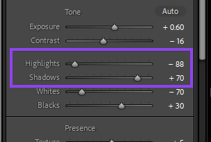
Pay attention to shadows and highlights, ensuring they complement the overall color palette rather than detract from it.
VII. Tips for Consistent Color Grading Photos
A. Creating custom presets
Streamline your workflow and maintain consistency by creating custom presets tailored to your style.
B. Using reference images for inspiration
Draw inspiration from other photographers or images to refine your understanding of different color grading styles.
C. Maintaining consistency across projects
Establish a cohesive look across your body of work by maintaining consistency in your color grading approach.
VIII. Advanced Techniques in Color Grading Photos
A. Color Grading for creative effects
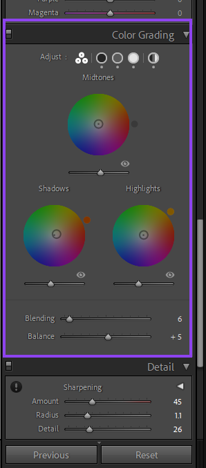
Experiment with color grading to add nuanced and creative color effects to your photos.
B. Black and White Color Grading Photos
Discover how color grading can enhance the tonal range and mood of black-and-white photos.
IX. Case Studies: Before and After
A. Showcase of photos without color grading
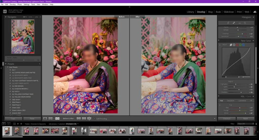
Compare raw, unedited photos with their color-graded counterparts to highlight the transformative power of color grading.
B. The same photos after professional color grading
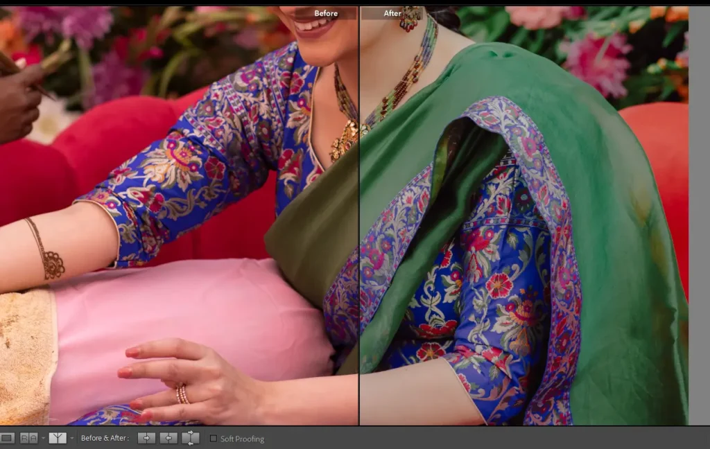
Unveil the magic behind professional color grading by showcasing stunning before-and-after examples.
X. Achieving Professional Results
A. Balancing vibrancy and subtlety
Strike the right balance between vibrant colors and subtle tones to achieve a professional and visually appealing look.
B. The role of color grading in storytelling
Explore how color grading contributes to the storytelling aspect of photography, enhancing the narrative within a single frame.
XI. Industry Insights: Color Grading Photos Trends
A. Evolving trends in color grading
Stay informed about the latest trends and techniques in color grading to keep your work fresh and relevant.
B. How professionals stay ahead of the curve
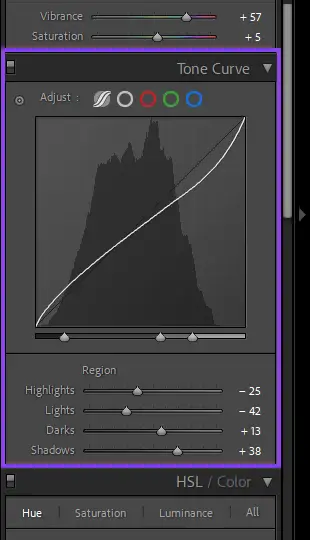
Gain insights into how seasoned photographers stay ahead of the curve by adapting to evolving color grading trends.
XII. The Impact of Color Grading on Social Media
A. Enhancing engagement with visually appealing photos
Understand the role of color grading in capturing the attention of social media audiences through visually stunning images.
B. Tips for optimizing photos for different platforms
Learn practical tips for optimizing your color-graded photos for various social media platforms to maximize engagement.
XIII. Common Myths About Color Grading Photos
A. Debunking misconceptions
Address common myths surrounding color grading to provide clarity and dispel any misconceptions.
B. Clarifying the importance of professional color grading photos
Emphasize the significance of professional color grading in elevating the overall quality and impact of photography.
XIV. Conclusion
In conclusion, color grading is not merely a technical process but an art form that allows photographers to infuse their work with emotion, depth, and storytelling. As you embark on your color grading journey, remember that it’s a skill that evolves with practice and experimentation.
Frequently Asked Questions (FAQs)

- Is color grading necessary for all types of photography? Color grading can enhance the visual appeal of various types of photography, but its necessity depends on the desired aesthetic and narrative.
- Can I achieve professional-looking results with free color grading software? While professional software offers advanced features, some free tools can still produce impressive results with dedication and skill.
- How do I avoid overdoing color grading and making my photos look unnatural? Striking a balance between enhancement and naturalness requires practice. Start with subtle adjustments and gradually experiment to find your style.
- Are there any industry-standard presets for color grading? While presets can serve as a starting point, creating custom presets tailored to your unique style ensures a more personalized and professional touch.
- What should I consider when optimizing photos for social media? Pay attention to each platform’s image specifications, aspect ratios, and color profiles to ensure your color-graded photos display optimally.



Pingback: Unleashing Creativity: A Comprehensive 5-Step Guide to WebP Plugin for Photoshop Download - NialTech webp plugin for photoshop download